Design Typography, Text, and Line Art
April 25, 2022 08:30am
Vector artwork is preferable when possible, but raster images (often photographic artwork) at high resolution work great as well.
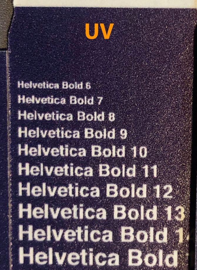
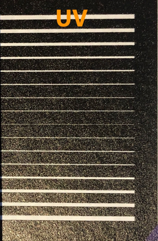
We recommend that artwork is provided at these minimum sizes/weights to print as crisp and clear as possible:
|
Type Size Minimum
|
Line Art Minimum |
|
|---|---|---|
| Digital Print on Corrugated
Material Mailer Boxes
Shipping Boxes
Corrugated Product Boxes
|
10pt | 1pt |
| Econoflex Boxes |
10pt positive 16pt reverse |
1pt positive 2pt reverse |
|
Digital Print on Paperboard Material |
6pt | 1pt |
A few important points:
- These are industry-standard recommendations. Regardless of how it may look on-screen, if artwork is smaller than these recommendations, it's unlikely to print well.
- Text that is too small can be fuzzy and even unreadable or not visible in the final
print.
Thin lines will likely result in a blurry or uneven print on the final boxes. - Try to keep text in bold fonts and colors for best print results.
This is especially important if you are using italics or script fonts. Small text, text with thin swirls or serifs, or very thin light text on a dark background will not print well and may not be legible. It is likely that this would result in a blurry print on your boxes. - Outline / vectorize all fonts before saving the final file versions to send/upload.
To do this in Adobe Illustrator, select all text and choose Type → Create Outlines.
Bonus Tip! We created a fun personality quiz for you, which will help you identify the type of packaging design for your own brand.


