A Guide to Professional Looking Packaging Design
Product packaging design is simultaneously easy and difficult. On one hand, you can print your brand name and logo on a box and call it a day. On the other, you have literally over a hundred competitors all vying for a bigger chunk of the market share.
Effective packaging design combines both. It helps you effortlessly get a bigger piece of the pie without taking too much of your resources, be it time or money. Professional-looking design is crucial for success, especially for businesses that are starting from scratch.
In this article, we go over the most important tips you must keep in mind for an effective and professional-looking packaging design.
What to Look For in Effective Packaging Design
Packaging design is not a one-trick pony. It has to be versatile and speak to its intended audience from many fronts. Each different facet works together in order to deliver a solid, cohesive, professional-looking package that amplifies the product or your brand messaging. Below are some of the most important design considerations you have to keep in mind:
- Target market – First and foremost, your packaging design has to speak to your audience. Even if your product artwork looks amazing, if it doesn’t strike a chord with your target market, it fails. Before even starting the whole design process, you need to identify who your audience is and how you plan to communicate with them.
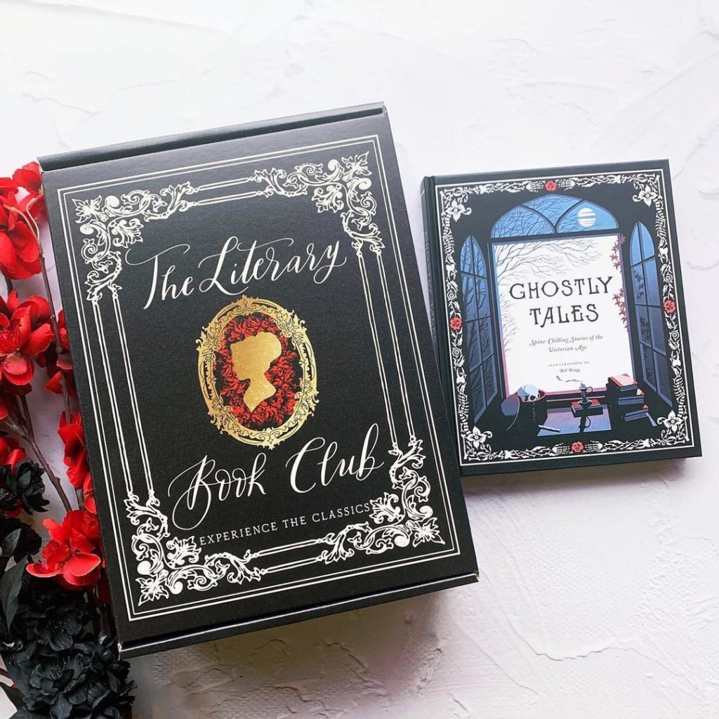
To illustrate, @theliterarybookclubbox‘s audience is lit geeks (we use that term with all endearment). They appreciate the Victorian-inspired design that the subscription box uses, from the intricate framing, the flowing script, to the gilded logo in the middle. They know their customers and speak to them in the language that they want and understand.

- Objective – The next important thing to identify is the objective for your packaging design. Outline your goal and make the design work to achieve it. Is it for a Valentines’ Day campaign? The artwork should communicate this clearly with plenty of design cues that show both branding and the holiday in question.
- Brand guidelines – Your branding has to be clear, cohesive, and identifiable. One of the goals for custom packaging is to build brand recall, especially for new businesses. Use identifiable design elements, such as a logo, brand colors, fonts, or a slogan. Be consistent with its use across different platforms, from traditional media to digital. The more customers see and associate specific design elements with your brand, the more they’ll be receptive to your messaging.
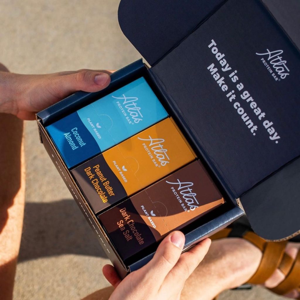
@atlasbars, a business that provide plant-based protein bars, uses their brand name and logo consistently across the different products they offer. It helps build recognition even if they are offered in different colors.

- Product specifications – It’s not needed for all products, but placing product specs is a good practice to do. For some items however, such as food, a label with complete information is required by law. If you need to place product details, plan your design ahead of time so that it’s still prominent but does not detract from the overall look.
Still at a loss on how to start designing? We have a beginner’s guide on how to create custom packaging and an article on how to find a fantastic packaging designer.
Design evaluation
Once you’re done with the initial design, it’s time to put it through the ringer. It’s important to get a fresh pair of eyes to look at the end product and offer constructive criticism. The design has to hold not just for yourself, but to everyone else, especially your target market.
Here are key questions to answer in evaluating your initial design:
- Is it aligned with your branding? You can have awe-inspiring visuals with eye-catching colors on the product packaging, but if your customers can’t recognize the branding, the campaign will be quickly forgotten. Ensure that your branding – be it brand colors, fonts, logos, or slogans, are prominent and consistent. This is the easiest and most effective way of building brand and name recall. Even if you go through seasonal changes in design, make sure to keep key elements that immediately tell the customer that the product is coming from your brand. If you need more information, read our article on why packaging is important for your brand.
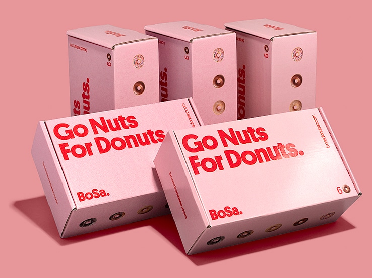
- Does it stand out among the competitors? When displayed on a shelf together with your competitors, does your packaging stand out? Or does it blend in and get lost with the others? Even if you ticked all the boxes for your packaging design, it still has to stand out or all of your work will be for nothing. Review what the competition is doing and go against the grain. If they are al using solid backgrounds, why not look for stunning patterns to use? Doing so will reward you with second glances that eventually lead to sales.
This design isn’t one you’d normally associate with donuts, but it sure stands out, does it?

- Does it resonate with your audience? In design, you have to be detached and flexible. You can’t stay married to a concept and refuse to adjust if someone disagrees. If the budget permits, you can run focus groups. If not, consider the counsel of friends, other employees, and customers. They will be able to provide valuable feedback through a different perspective.
Printing considerations
After finishing the design of your product packaging, you have to get it ready for print. This is an important step as well since even if your initial design looks amazing, if it’s not optimized for print it will be all for naught.
- Check the dieline – If you opted to design offline and upload your own file, make sure that all the measurements are correct. Request a dieline with the specs you need and double-check that the printing areas are correct, especially if the printing is full-bleed.
- Color space – One of the most common errors in printing is not changing the color space from RGB to CMYK. The former is optimized for the screen while the latter is for print. Most online printers will immediately warn you that your file is not the right color space but in the cases they don’t, there is a chance that the colors will appear incorrect, washed out, or worse.
- File format – If you opted to create a design on your own, make sure that your file is in AI, PDF, or EPS format.
- Color options – With Packlane, you have the freedom to use the full gamut of colors. There are no color restrictions for printing. You can use a single color for the whole box or use different shades for sides, the interior, and exterior.
You also have the option of going the minimal route.
Building the complete package
You finally have your custom box hot and fresh off the printers. Now what? It’s time to put the proverbial cherry on top.
- Protect the outside – It would be a shame if the custom packaging you worked so hard on will be banged up while in transit. Use a branded bag with it or better yet, use a shipping box. Protecting the main box gives a better impression to the end user especially with the popularity of unboxing videos.
- Take care of the inside – In a similar vein, you can’t throw your products inside the box and call it a day. It has to be protected and professionally presented. When the customer opens the box, the products inside should look pristine and reflect your business in a good light. Use packaging add-ons and void fill such as tissue paper, bubble wrap, and tissue coils.
- Add an accent – Your creativity doesn’t have to stop with the main product packaging. Be extra and add embellishments you see fit. You can throw in stickers inside the package so that customers can place them on their personal items such as laptops and tumblers. You can also add hang tags to place product information that isn’t on the box design.
Delivering the final product
The road to effective, professional-looking packaging design is not a straight line, but there are plenty of guideposts along the way. Some of these are set in stone, while some have more wiggle room for you to find your own way.
Get your packaging journey started with Packlane today.


